Mike’s Car Clinic Redesign
January 2022 - March 2022Overview
A 9 week project for my class, Practicum for Professional Web Design. I worked in a team of 4 where we had to reach out to a client to redesign their website through Figma. Through this process, we were able to get connected to Michael Chon from Dublin, CA where we were able to work together with our client to determine his needs in regards to an ideal website. According to his feedback, we attempted to redesign his website in figma to a website that exuded a fun, simple, and interactive experience for users.
Team


Maged Waly
Stanley Ho
Issac In
Me
Client Relations /UX Designer / User Researcher

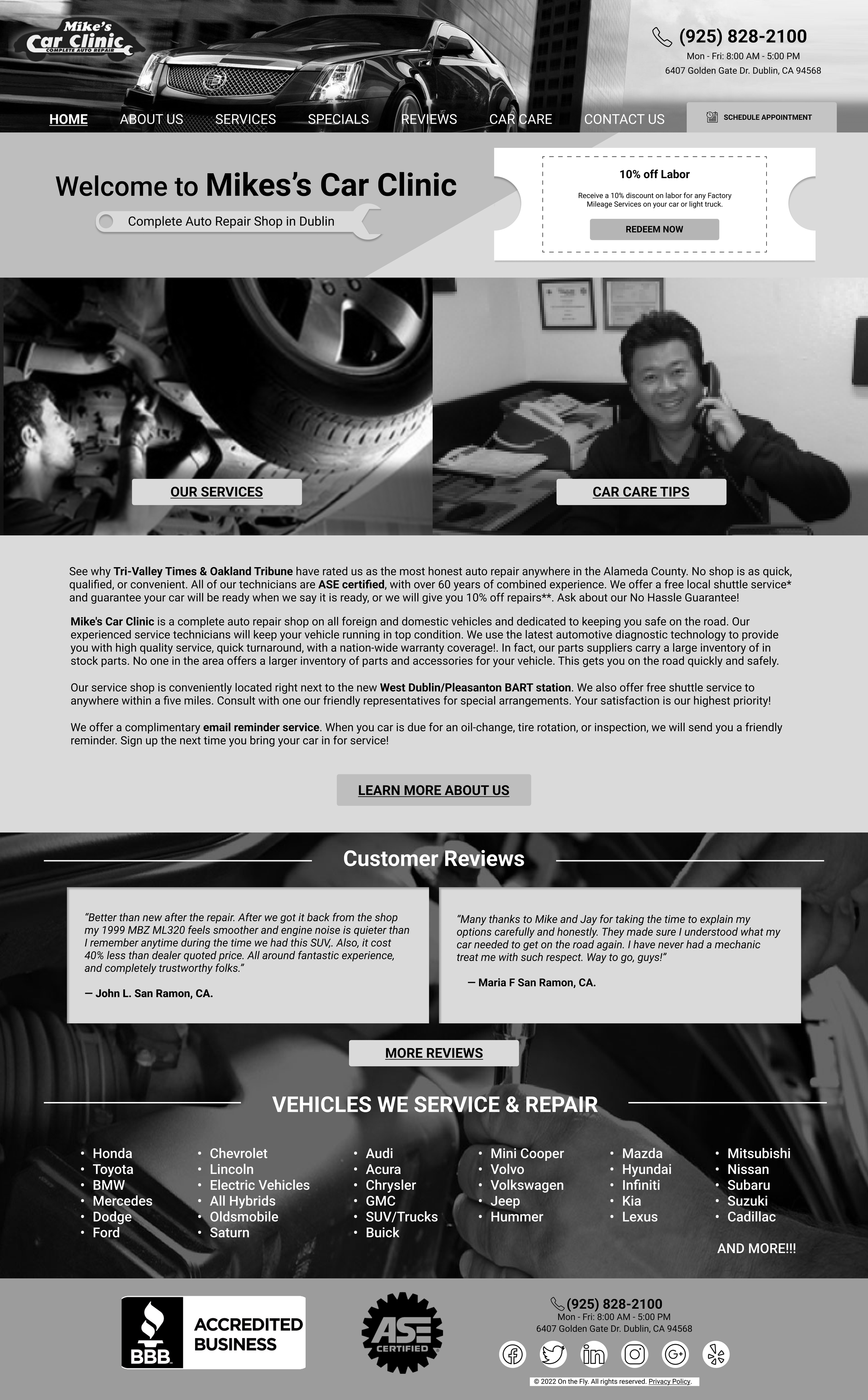
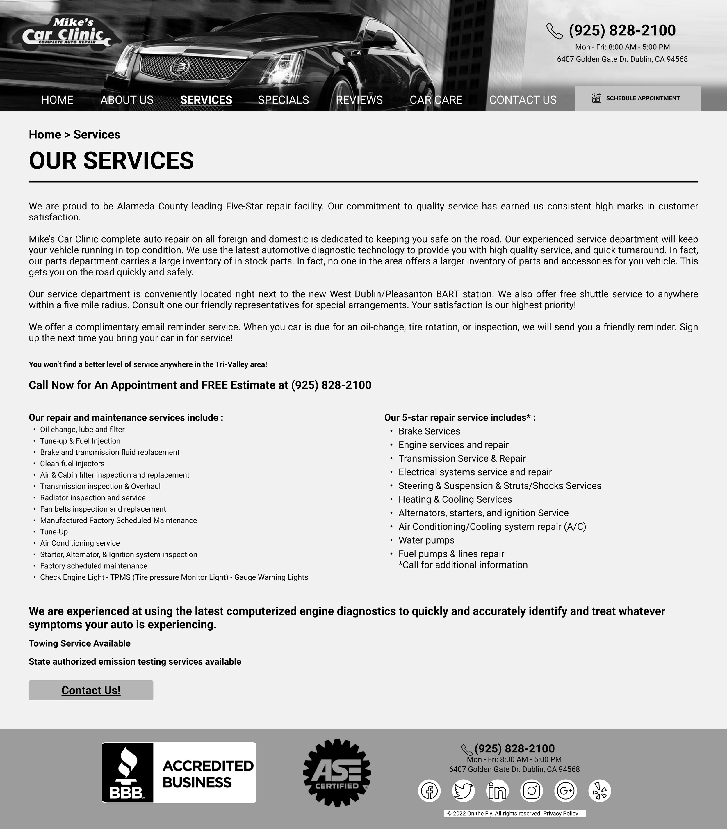
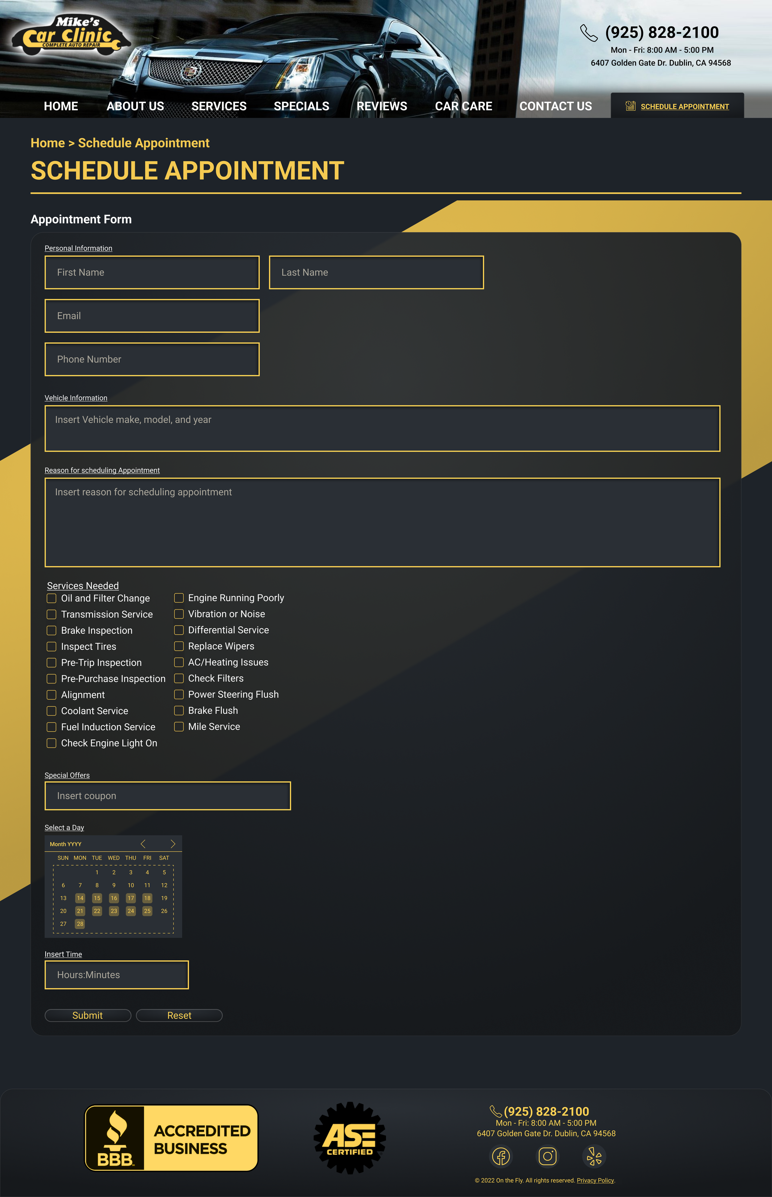
Final Desktop Design
Final Mobile Design
Problem
The current website is outdated and is not able to contend with competitors in the Dublin area. The website is in need of a modern refresh that is welcoming to loyal and new customers along with prioritizing interactivity with them.
User Research
Due to limitations in location, we weren't able to interview people in the are of Dublin, CA. However, we did 10 user interviews with people that consisted of inexperienced car owners, experienced car owners, and car enthusiasts.
10 male interviewees from the ages of 20-24
We chose all male because our client's regulars only consisted of males
At the time we didn't consider the bias in our data due to limiting ourselves to only young adults, however, this is our conclusion to the right along with client feedback
Through our Research we found that
Website looks out dated and plain
Too many walls of text which makes finding info hard
Scheduling for appointments is essential
Testimonials/reviews are key in finding credibility
Finding services and package deals is important in finding quality support
Competitive Analysis
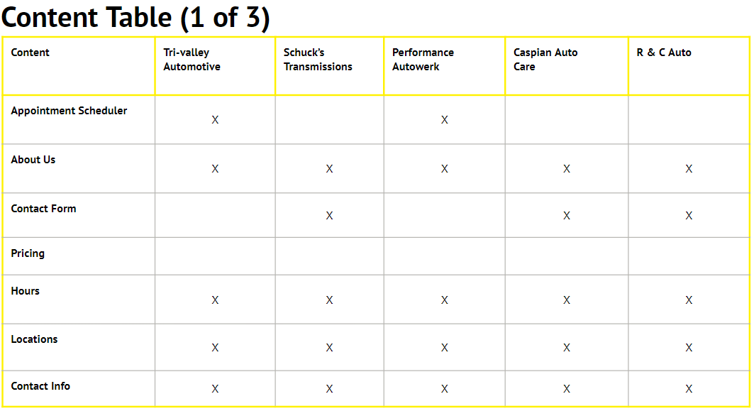
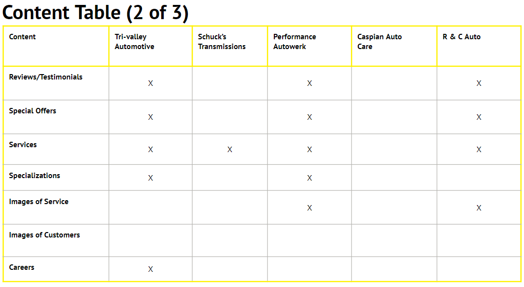
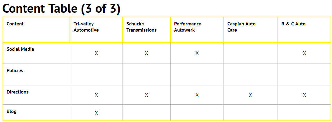
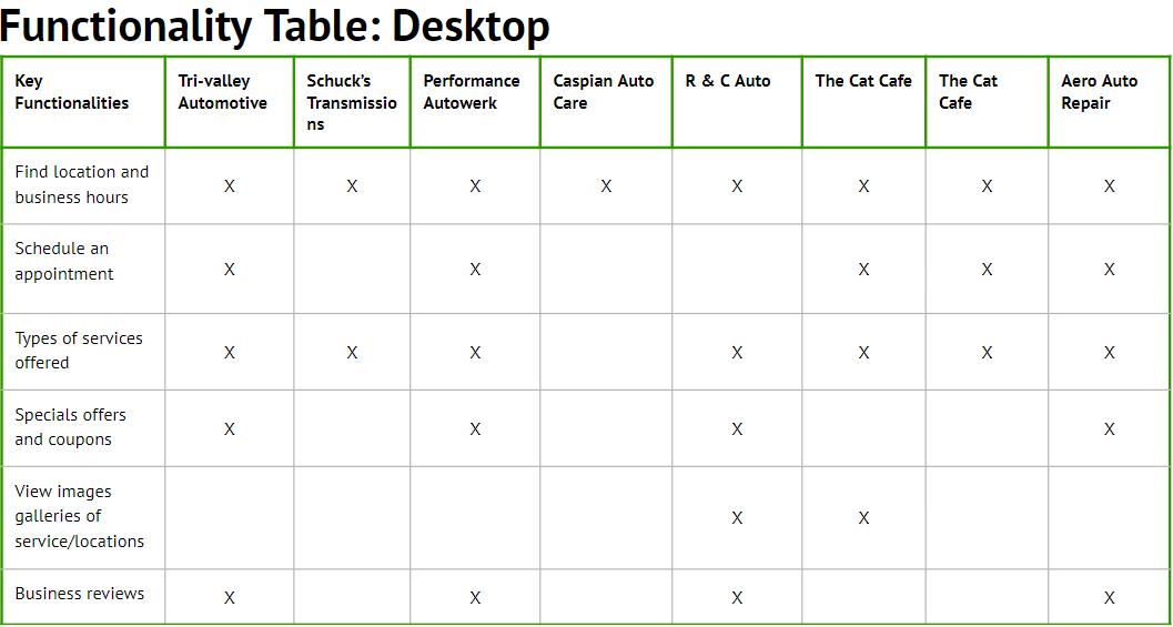
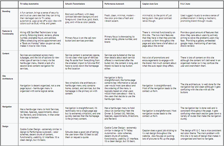
Make content usable, readable, and accessible for mobile layouts
Detailed, non-overwhelming list of services offered by the mechanics
Most auto repair shops emphasize on deals/promotions and appointment scheduling process, location, hours, contact info, and testimonials/reviews.
Making an educated appointment time w/o assistance
Reduce cognitive load on users by taking advantage of excellent typography and proper contrasting
Key Takeaways

Site Architecture
MoodBoard

We each took creative liberties after conducting our prior competitive analysis and created multiple mood boards. However, this was the final mood board we selected as it invokes a more modern refresh vibe of Mike’s Car Clinic. Our client also mentioned he wanted to keep the black and yellow color schemes.
Low Resolution Wireframes
Mobile Lo-Fi Prototype
Mobile High-Fi Prototype


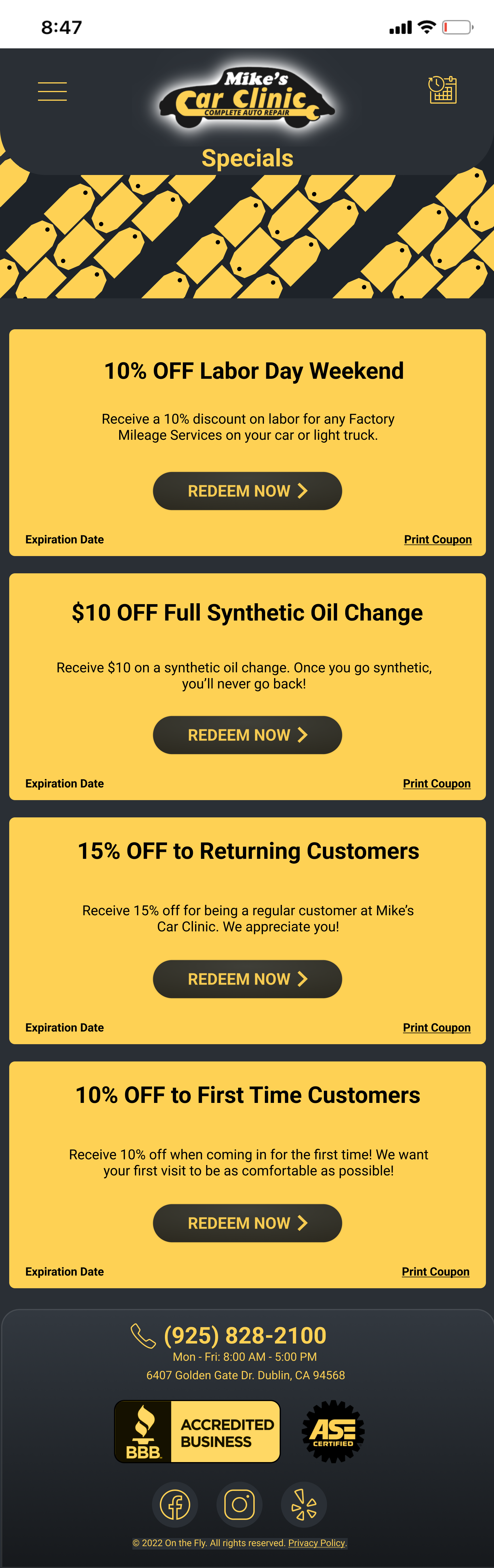
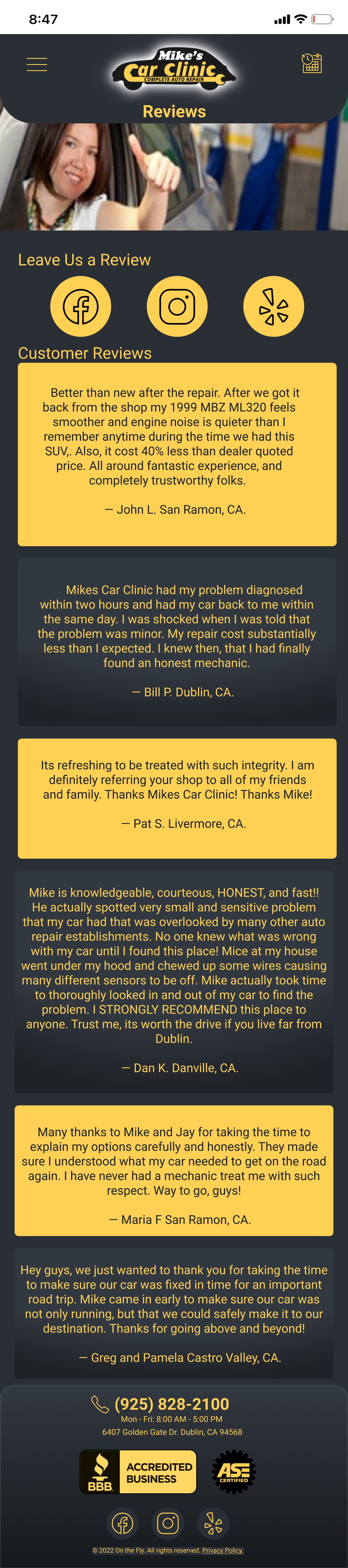
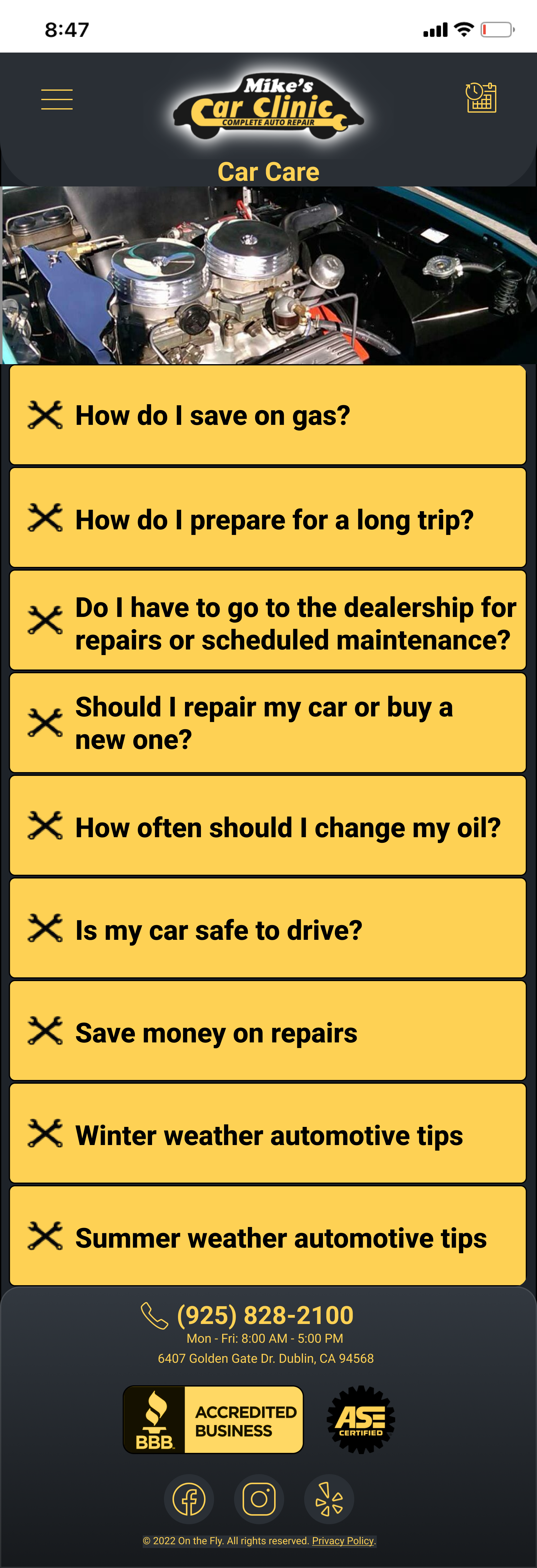


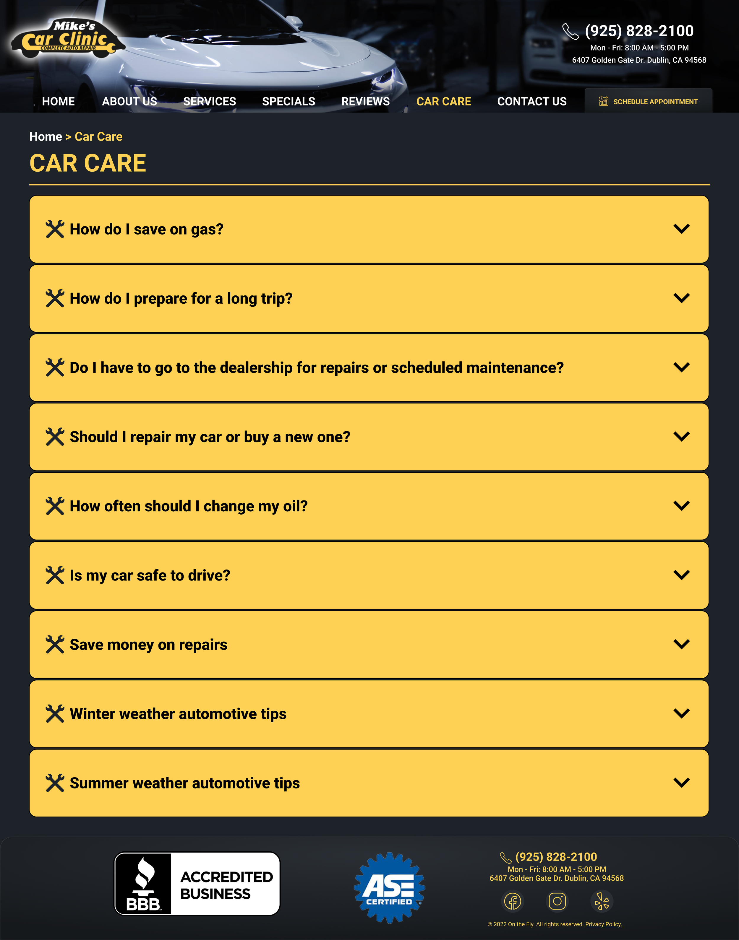
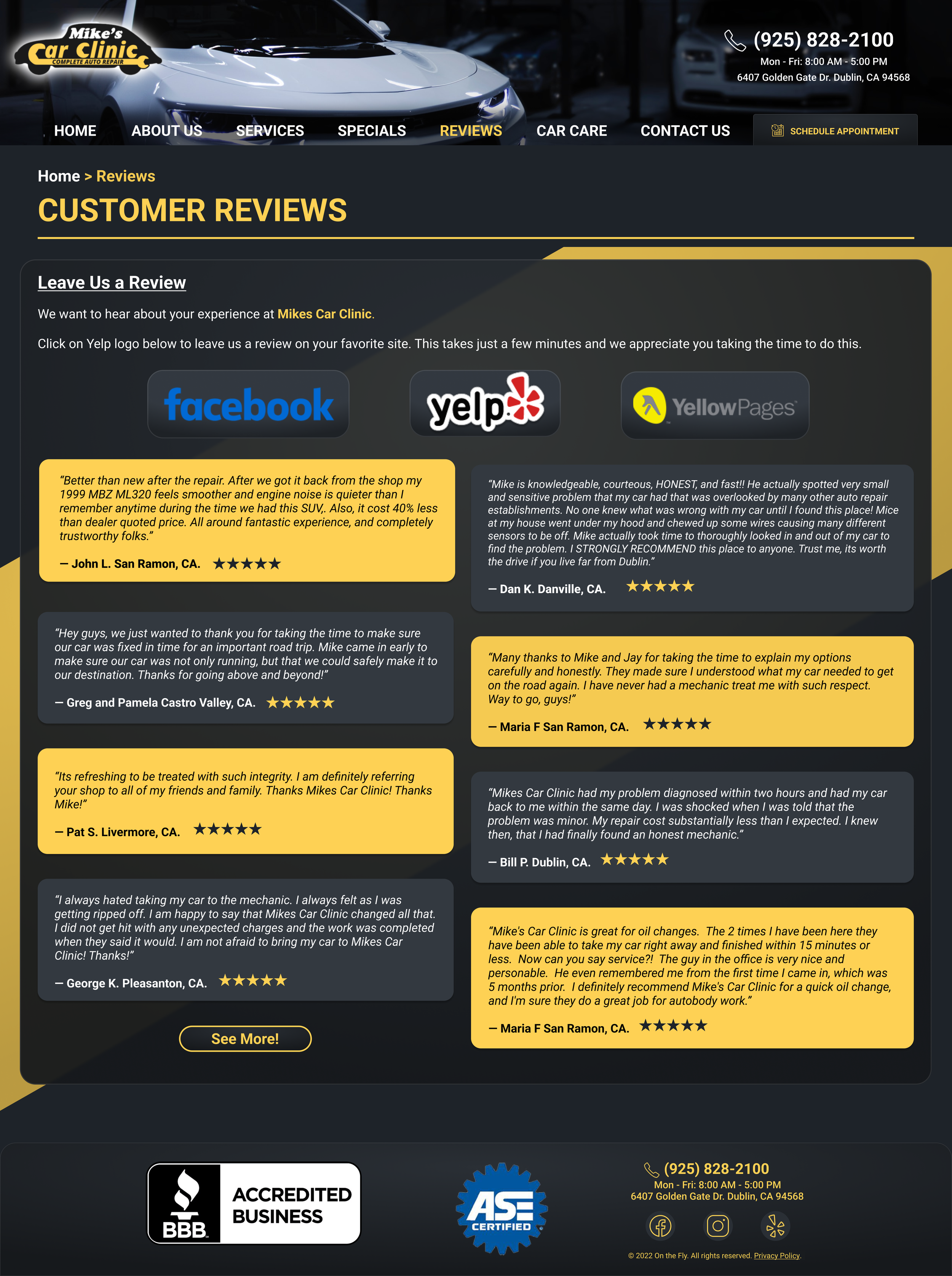
Mobile Final Version

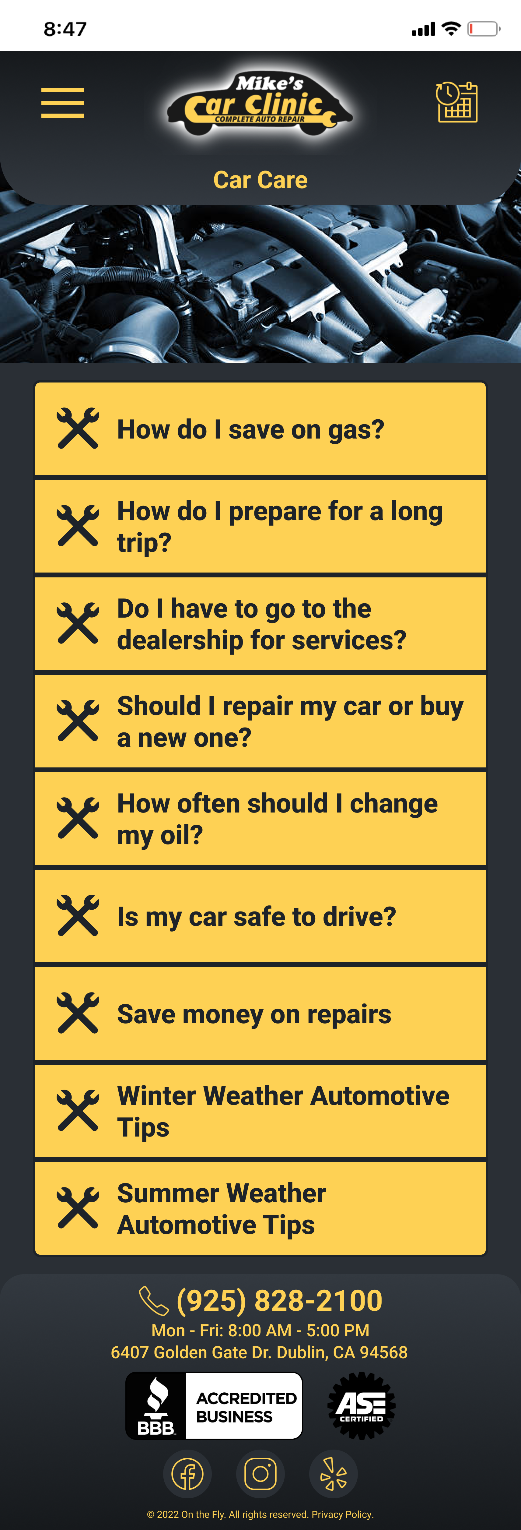
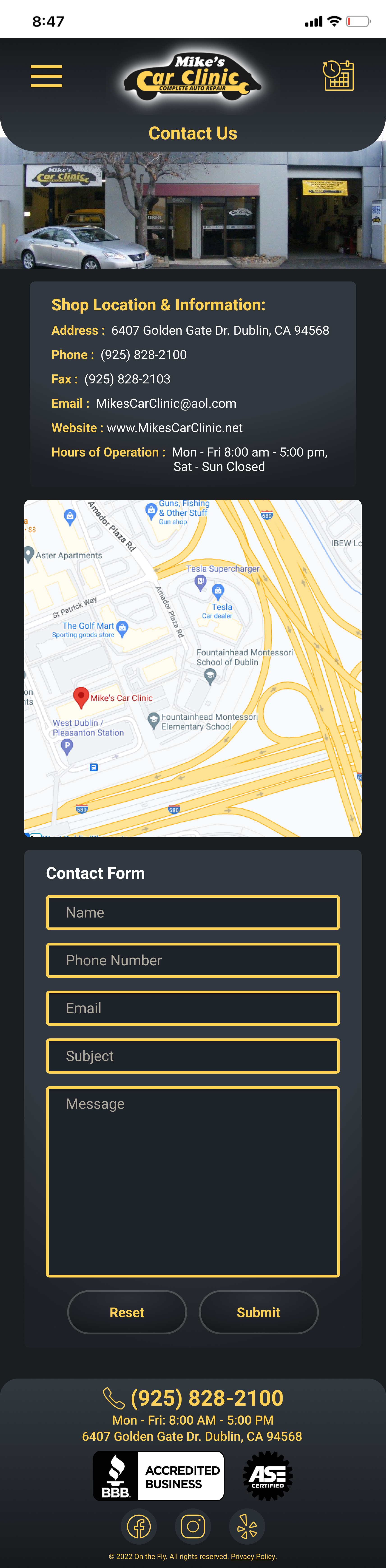

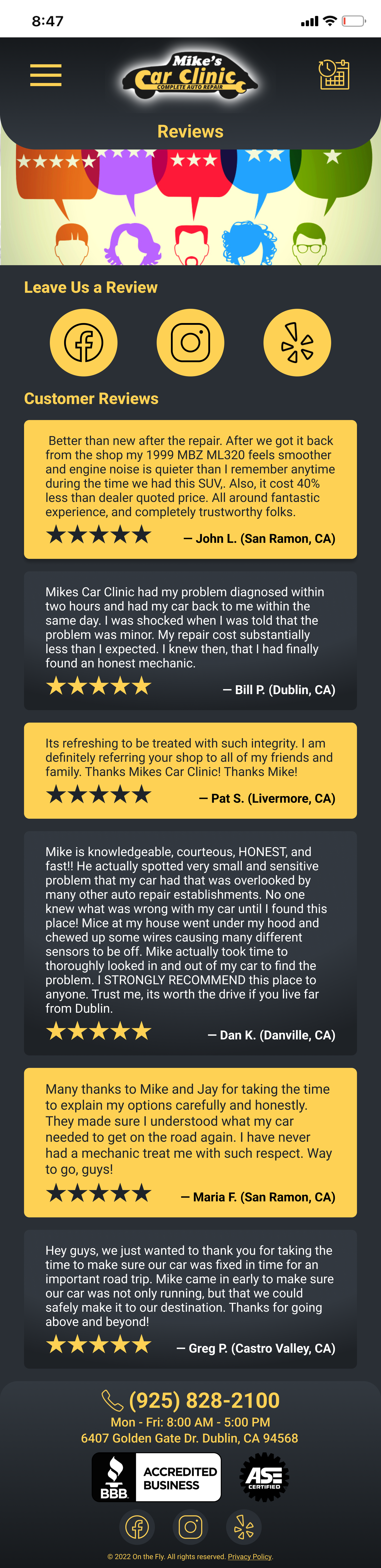
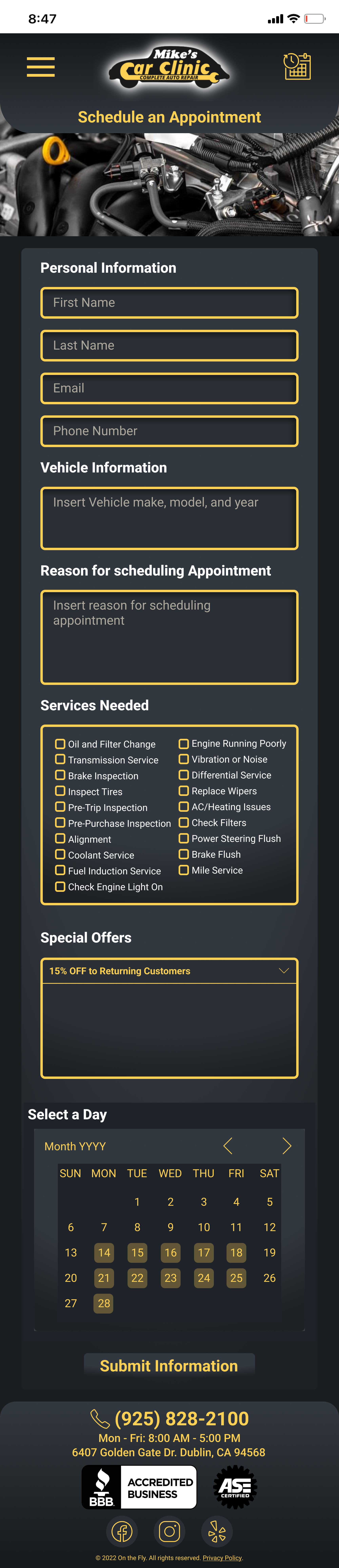
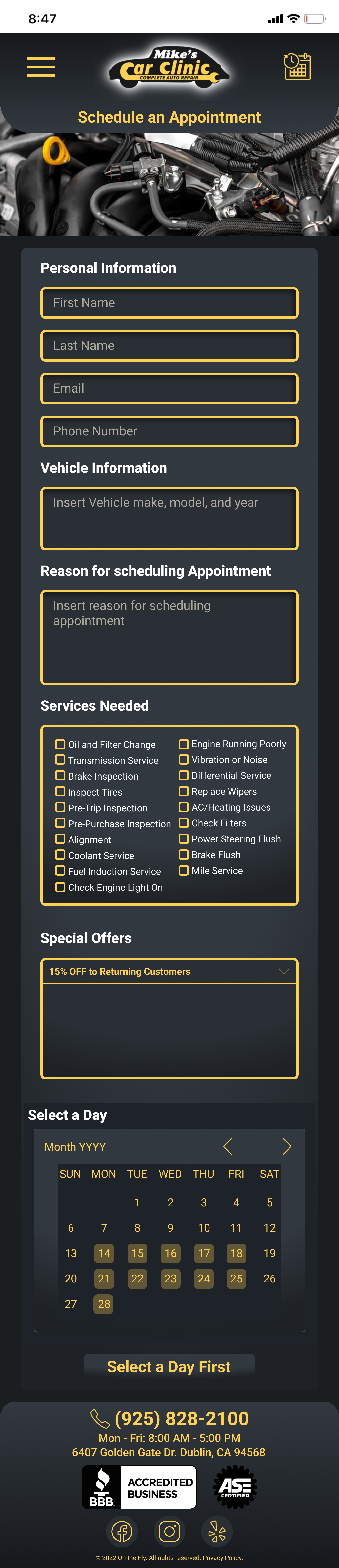

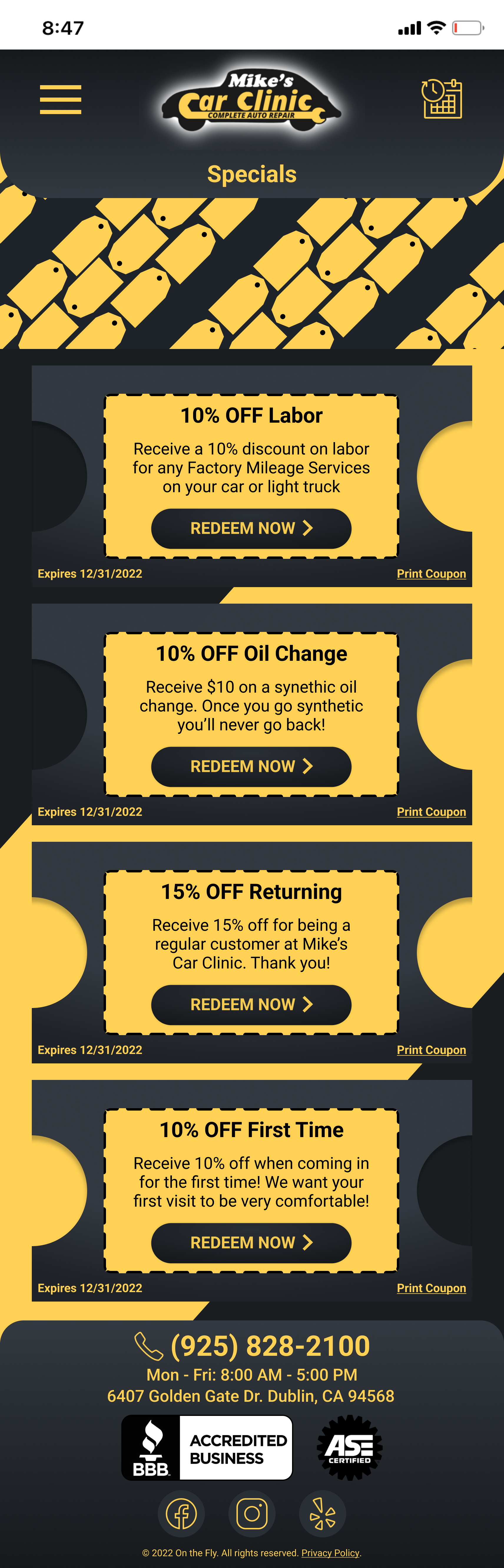
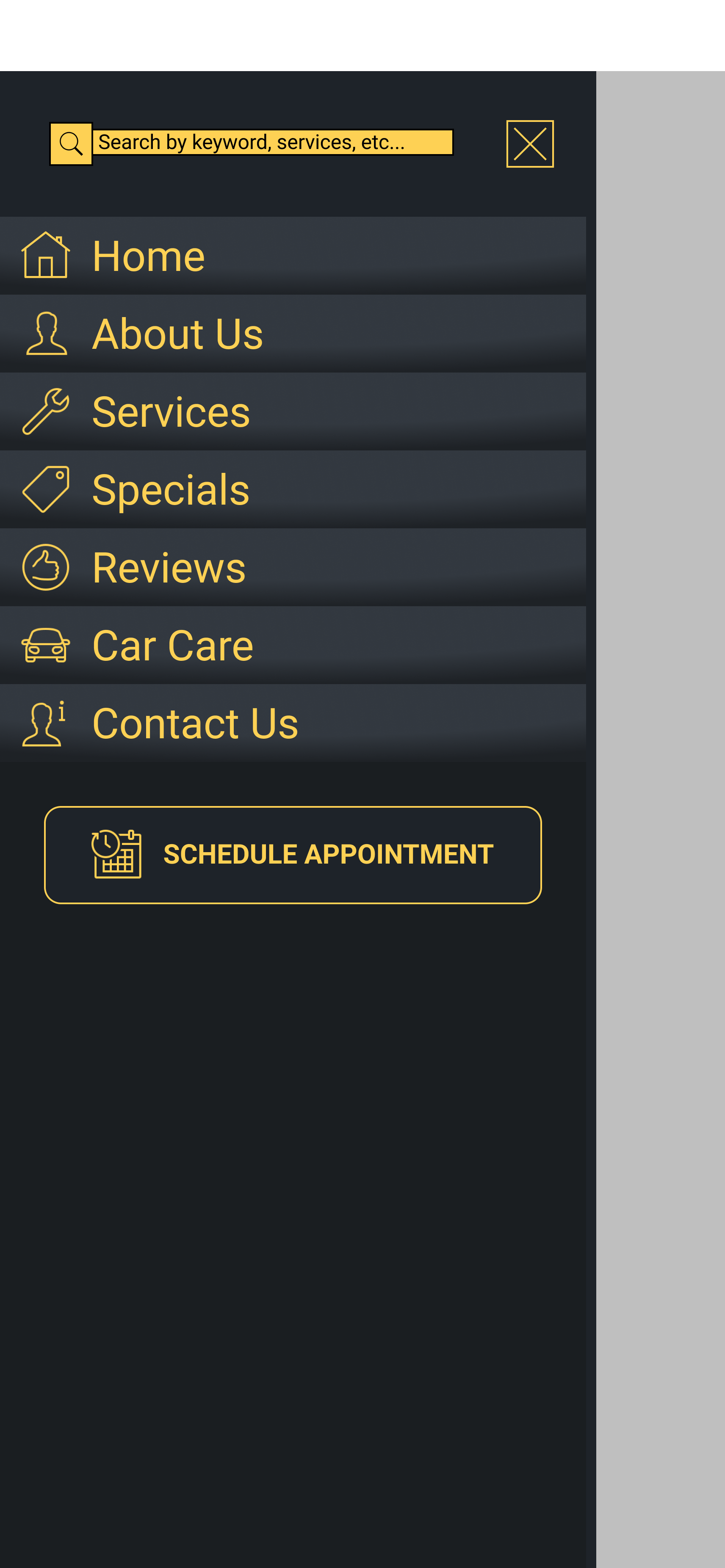
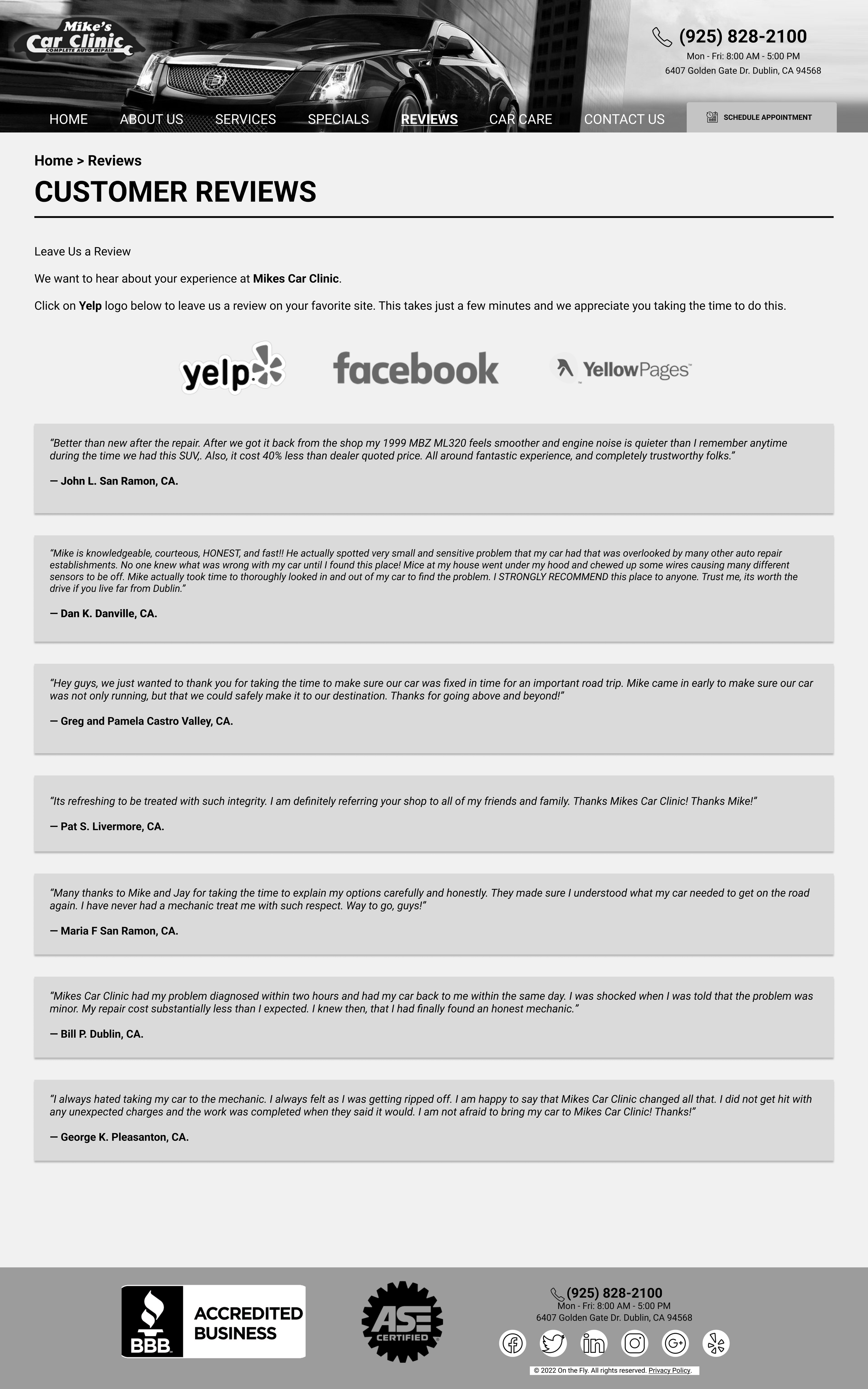
With many iterations we came down to this final mobile design above. One big challenge my team had was that our client wanted us to keep all of the content he already had on the current website. However, with user testing, the text was just too overwhelming to them which made it hard for us to find a good balance for a small screen. As a result, we tried to display the text in a more readable fashion by highlighting key words and phrases with a different color font along with meaningful titles that described the bodies of text. One great example of this would be on the About Us page. Also according to feedback, we edited our margins to leave breathing room for our images and text along with making the app more like a dark mode rather than a lot of yellow since we got a lot of different complaints with the yellow color of the site. We believe we did our best in presenting the information needed in a clear way along with prioritizing engagement with users through the appointment and deals system.
Desktop Lo-fi Prototype
Desktop High-fi Prototype

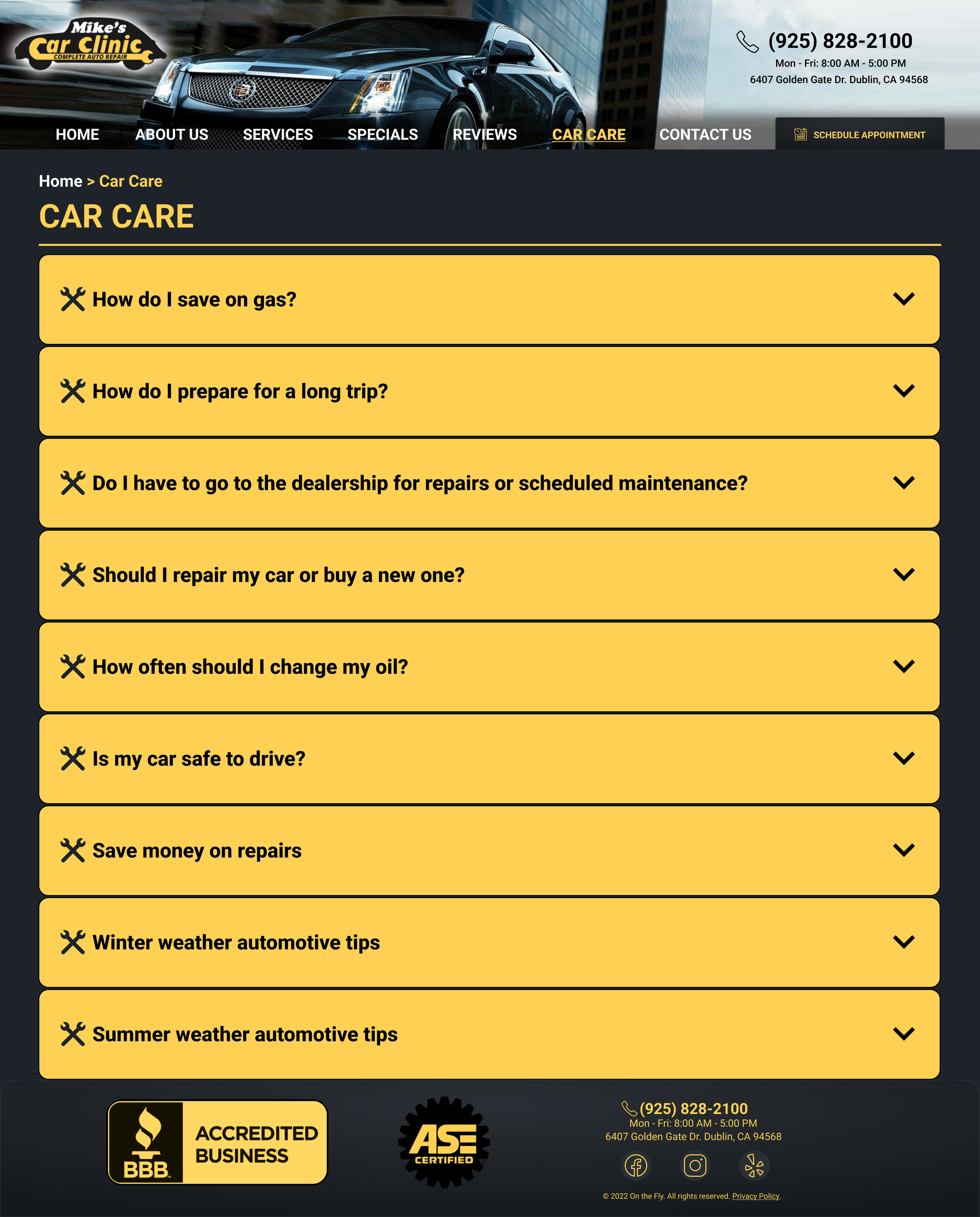
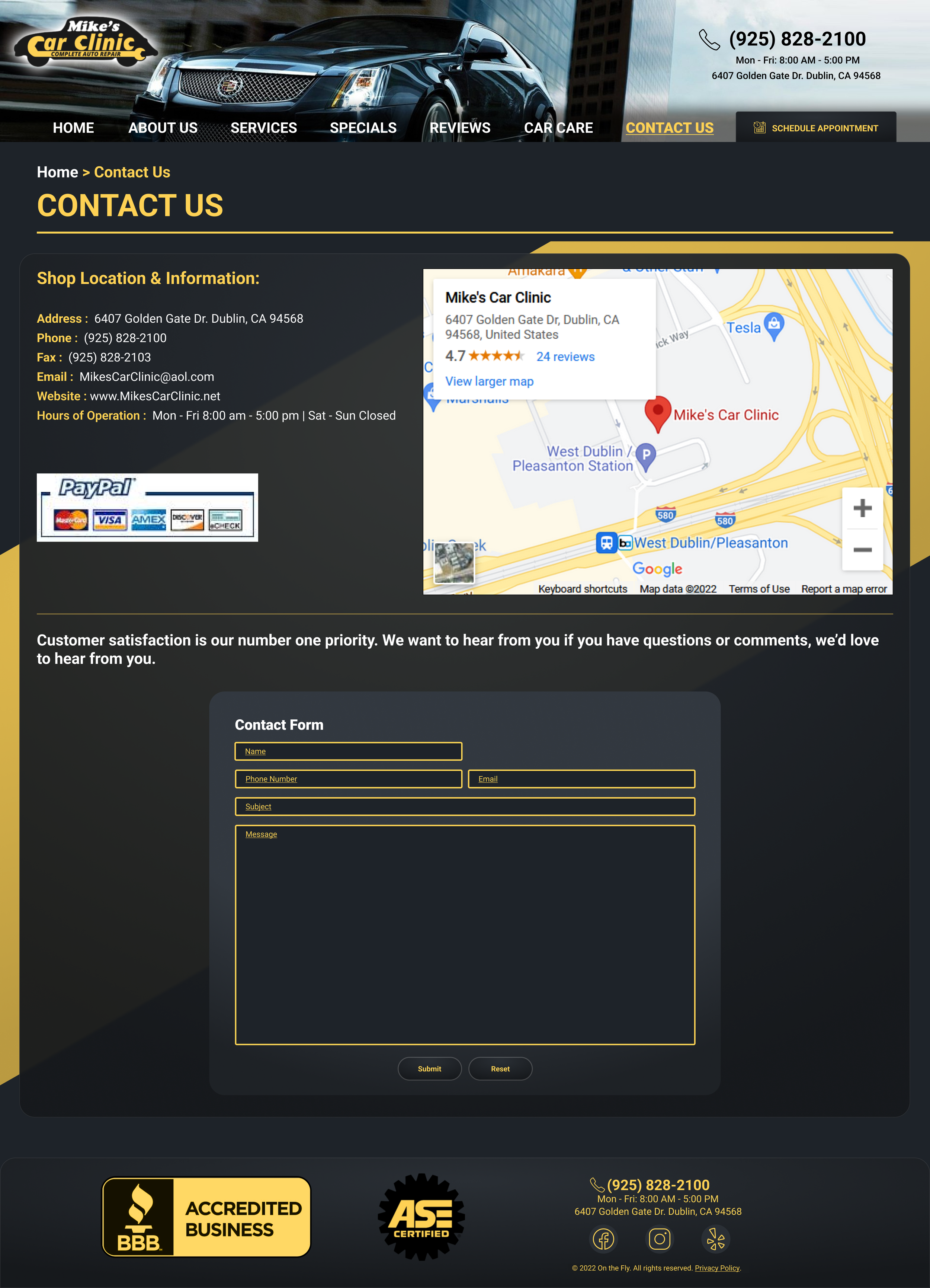
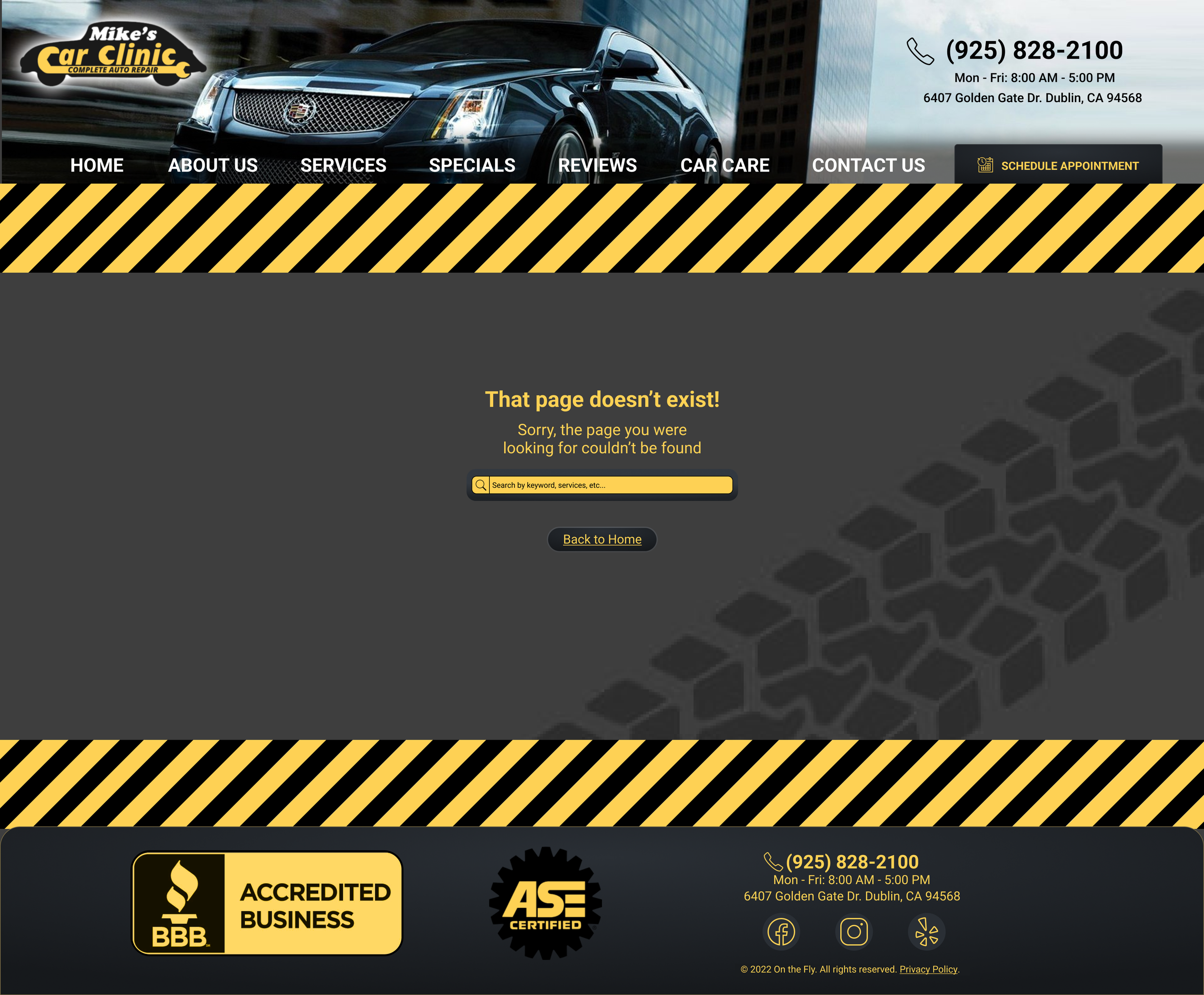

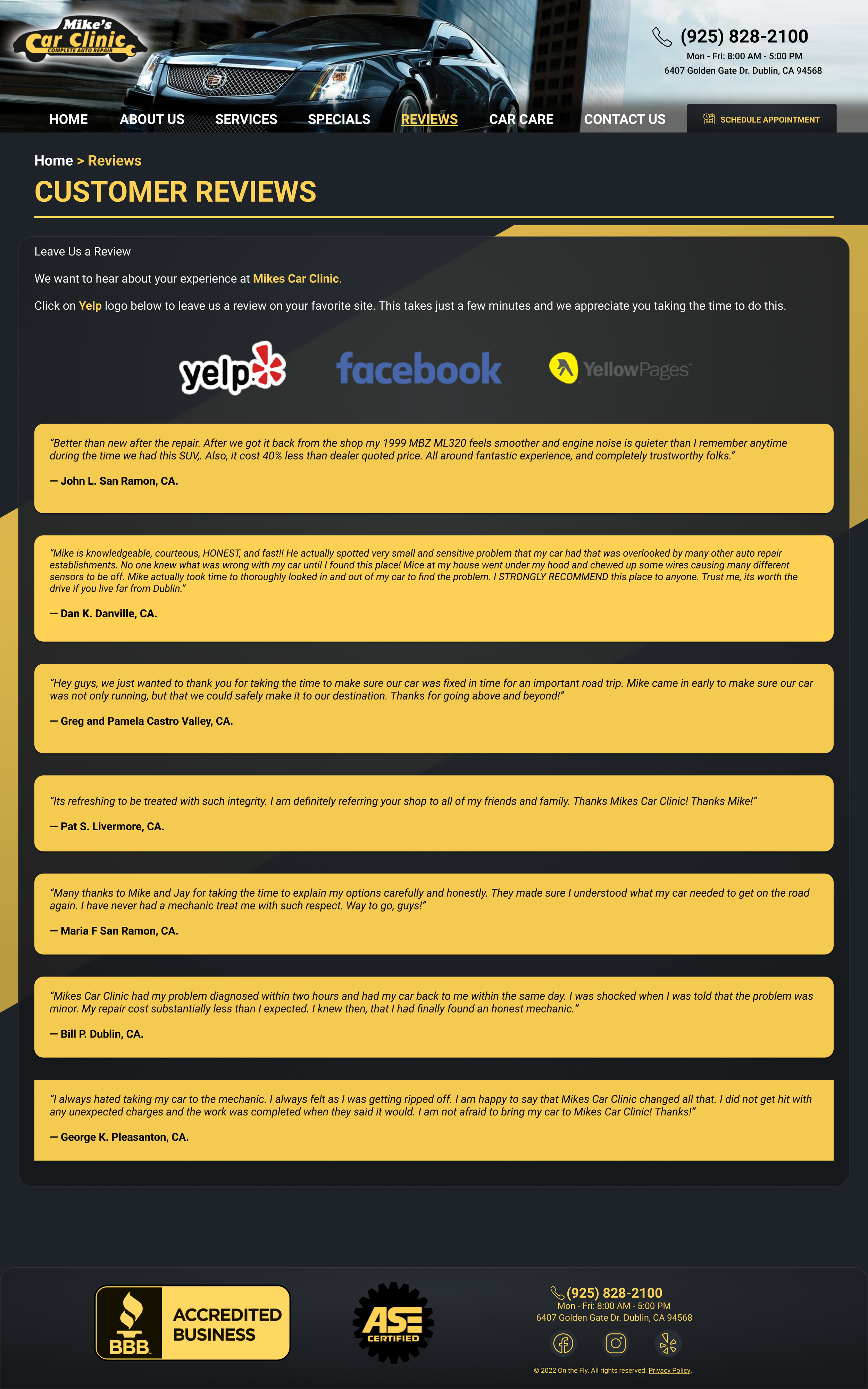
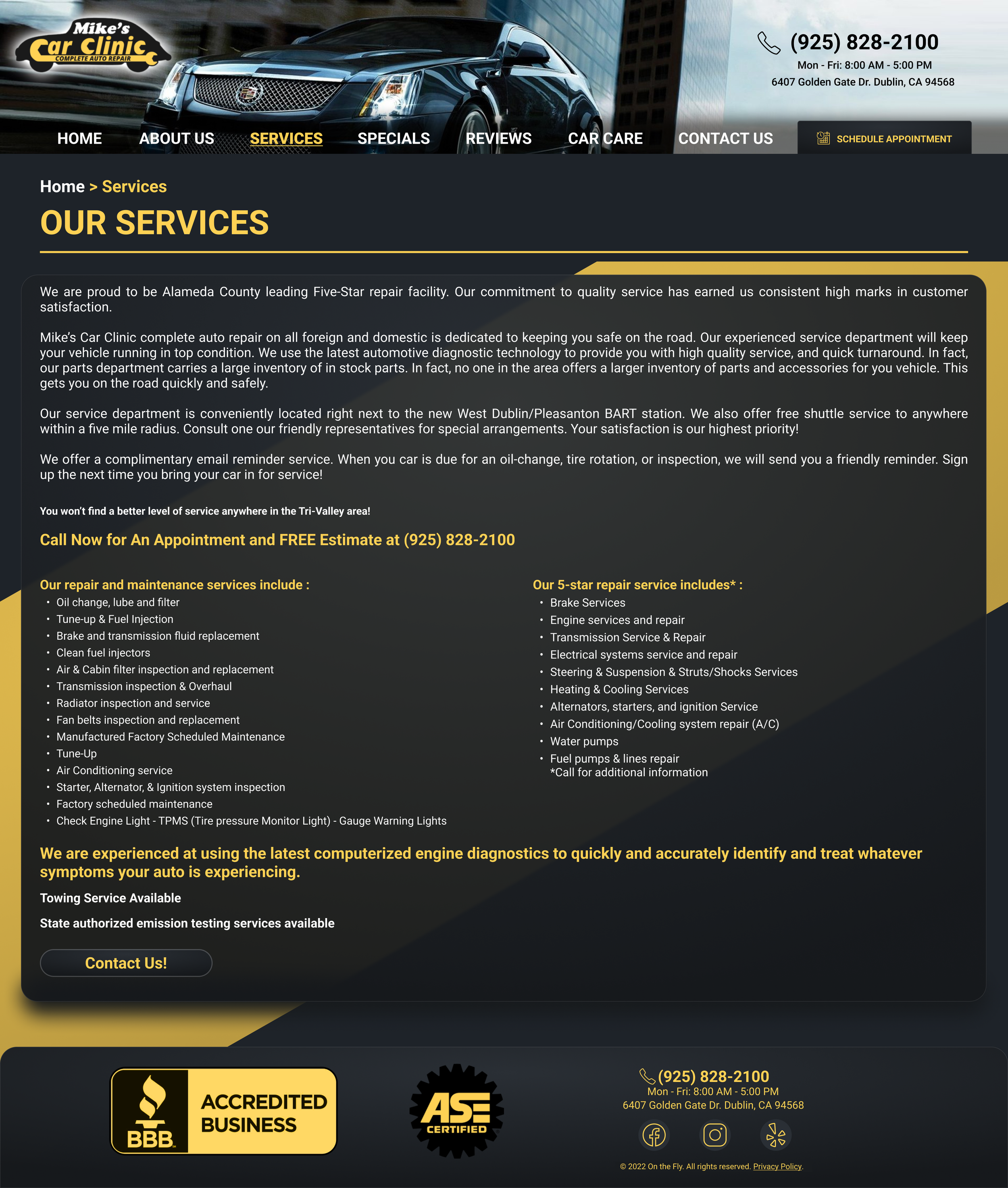
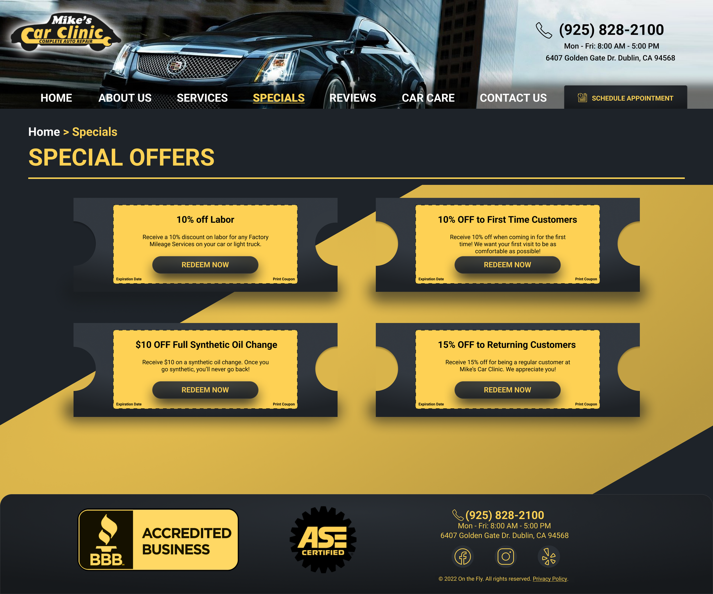
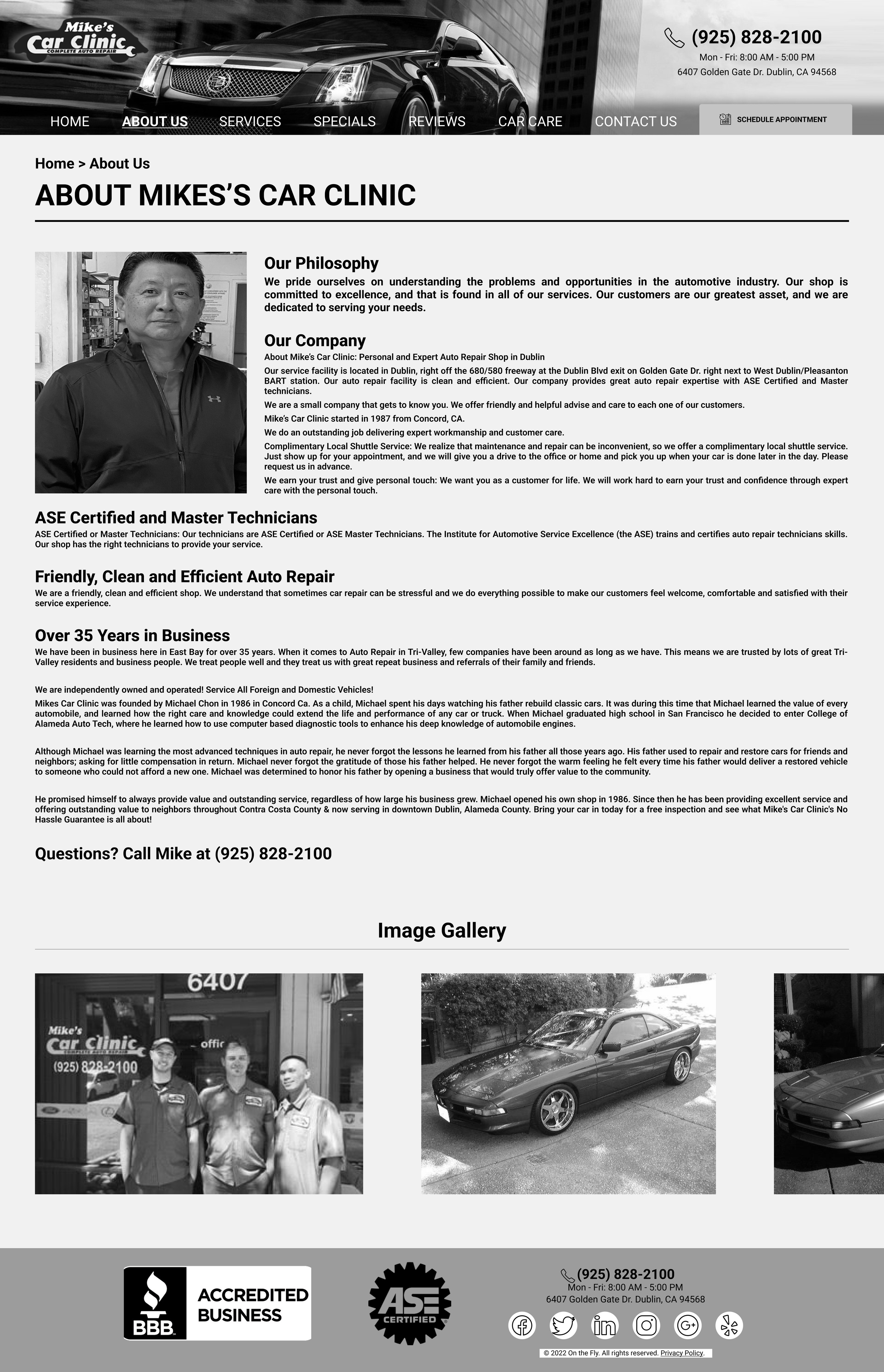
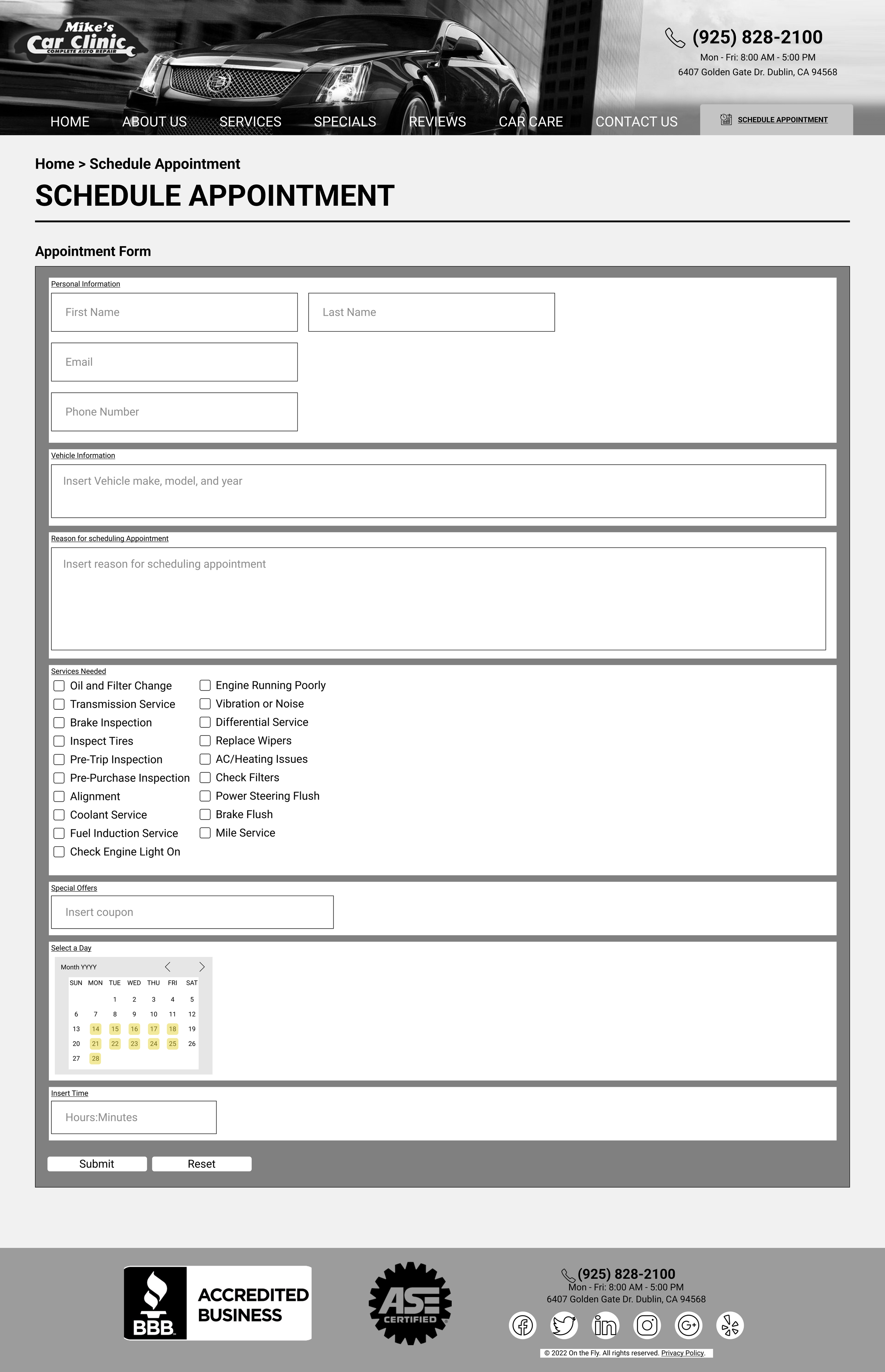
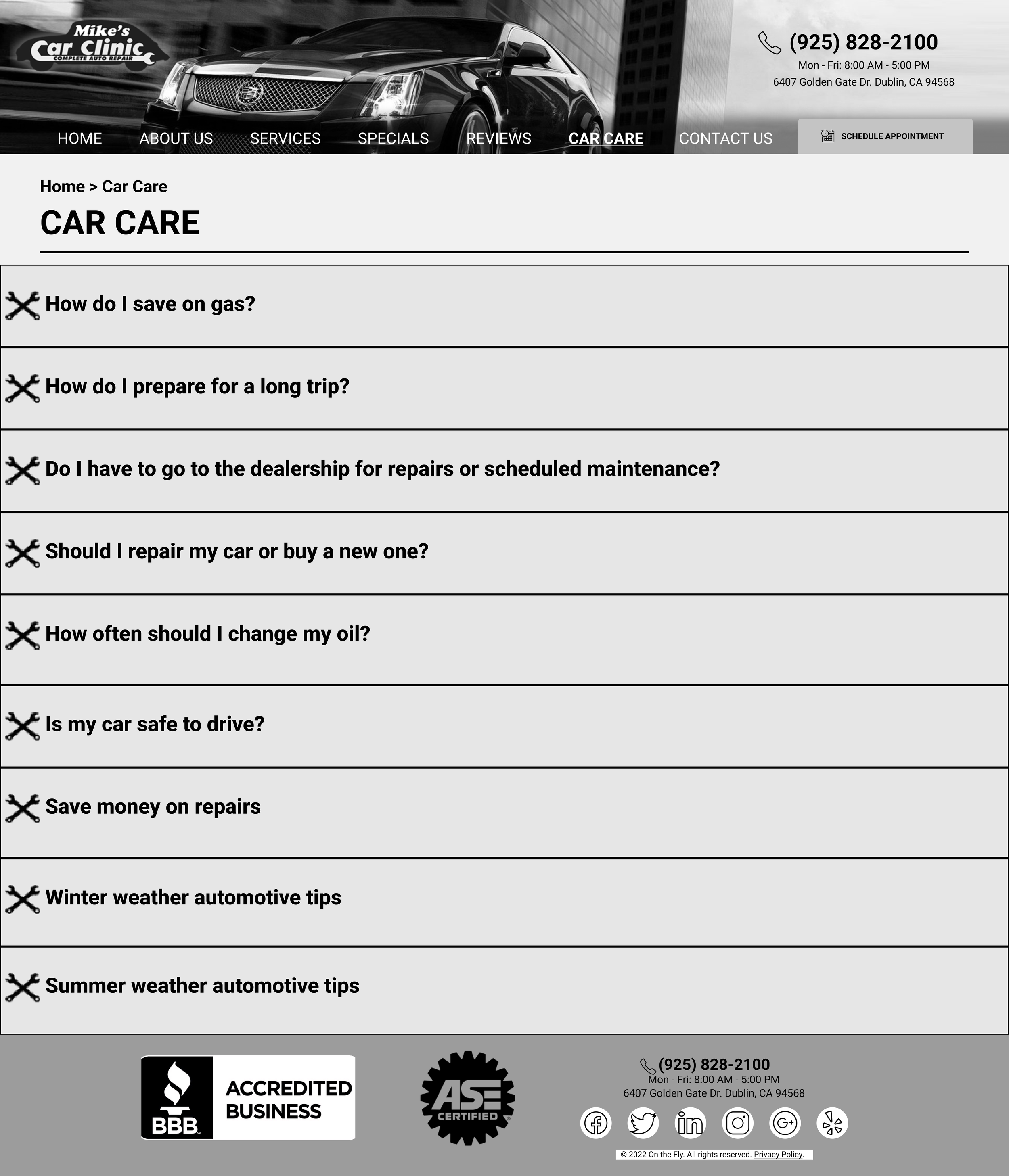
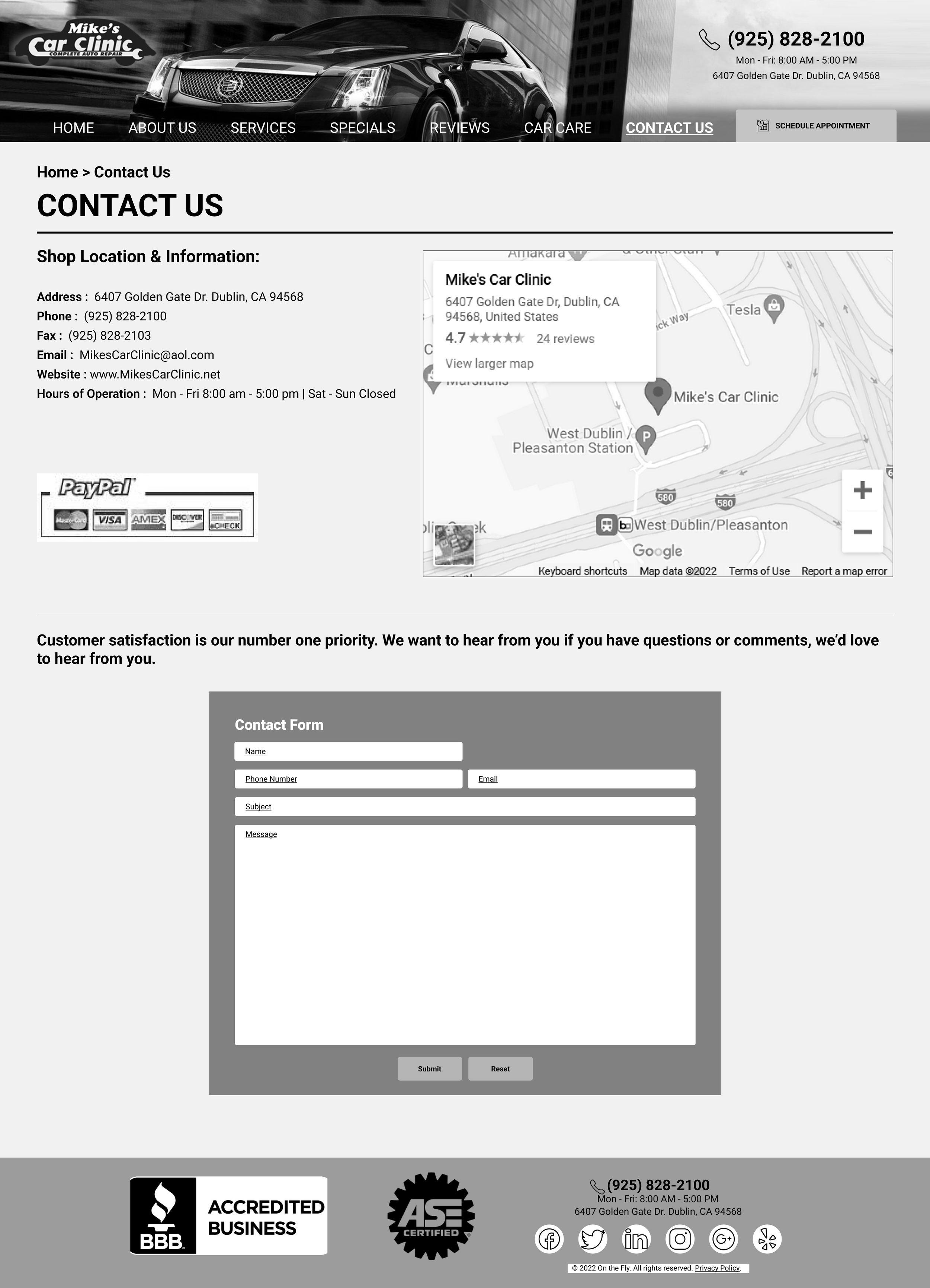
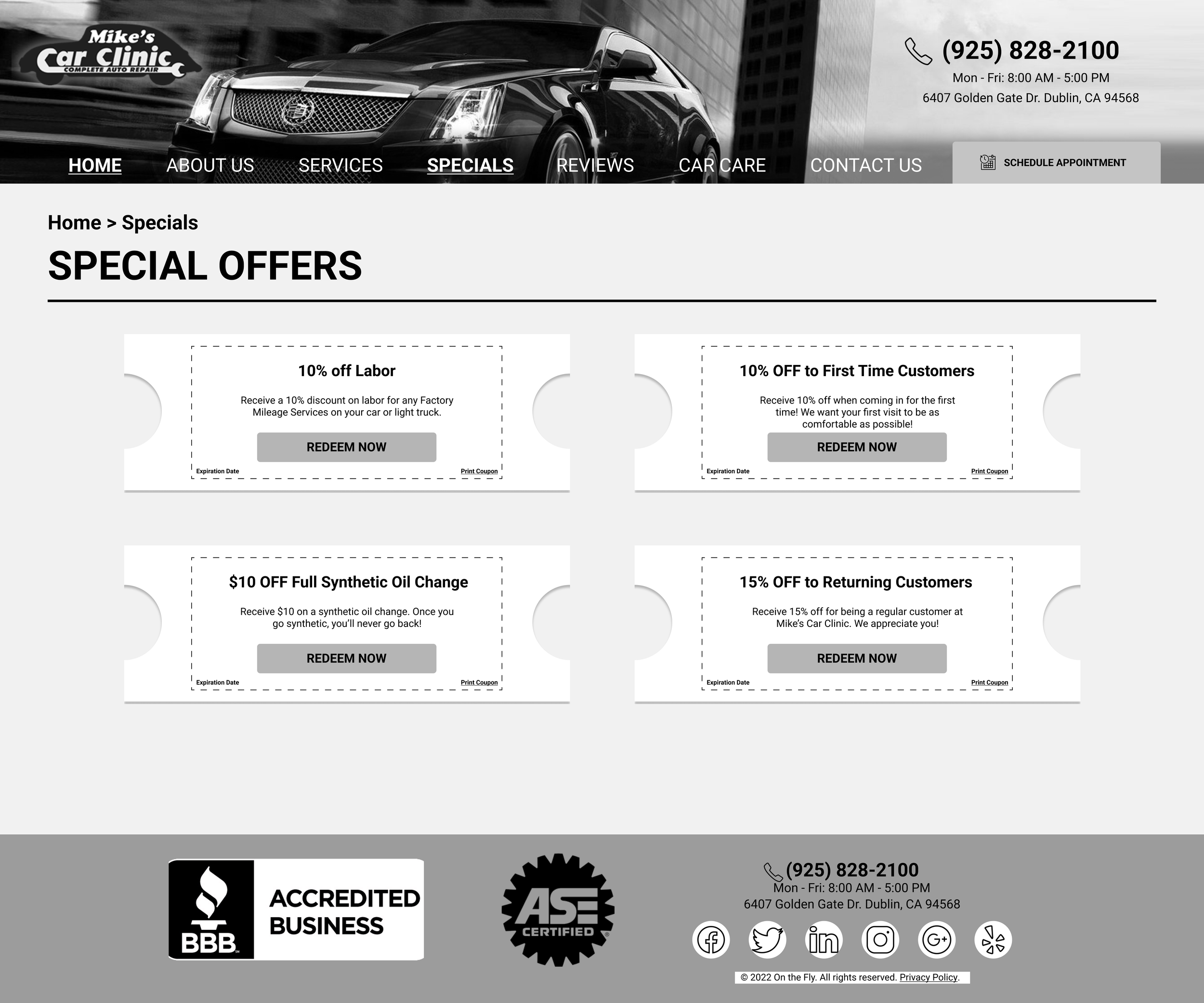
Desktop Final Version
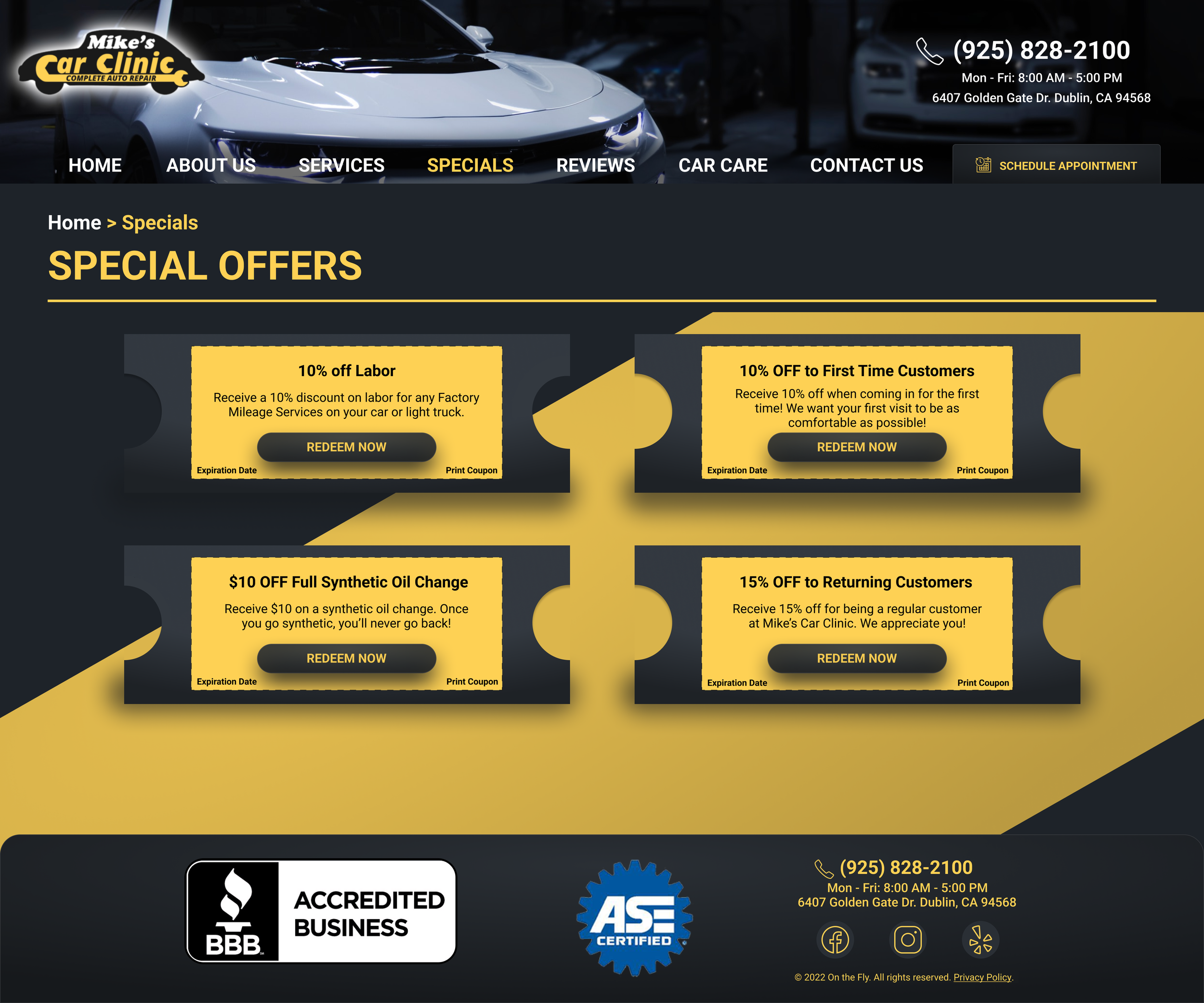
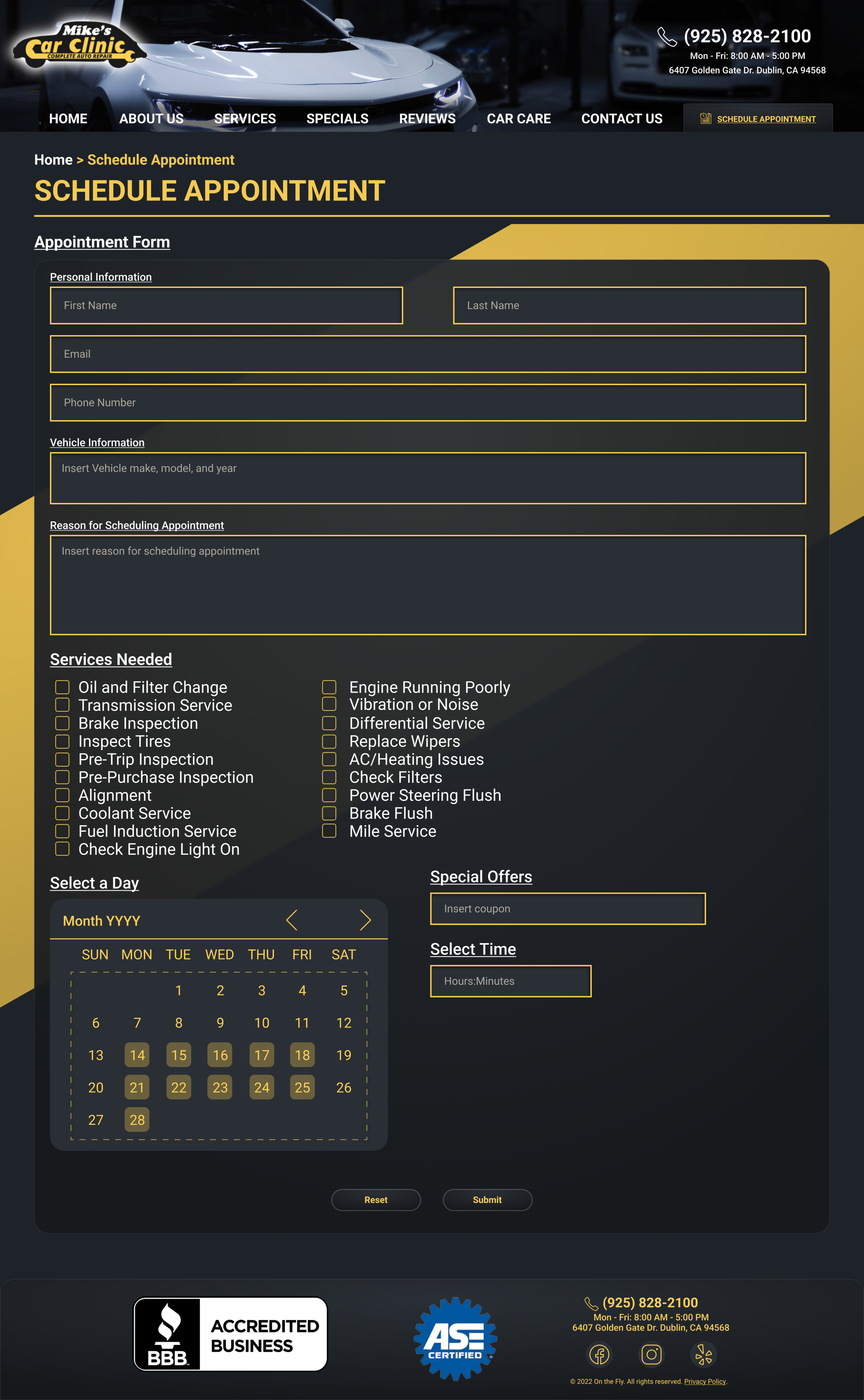
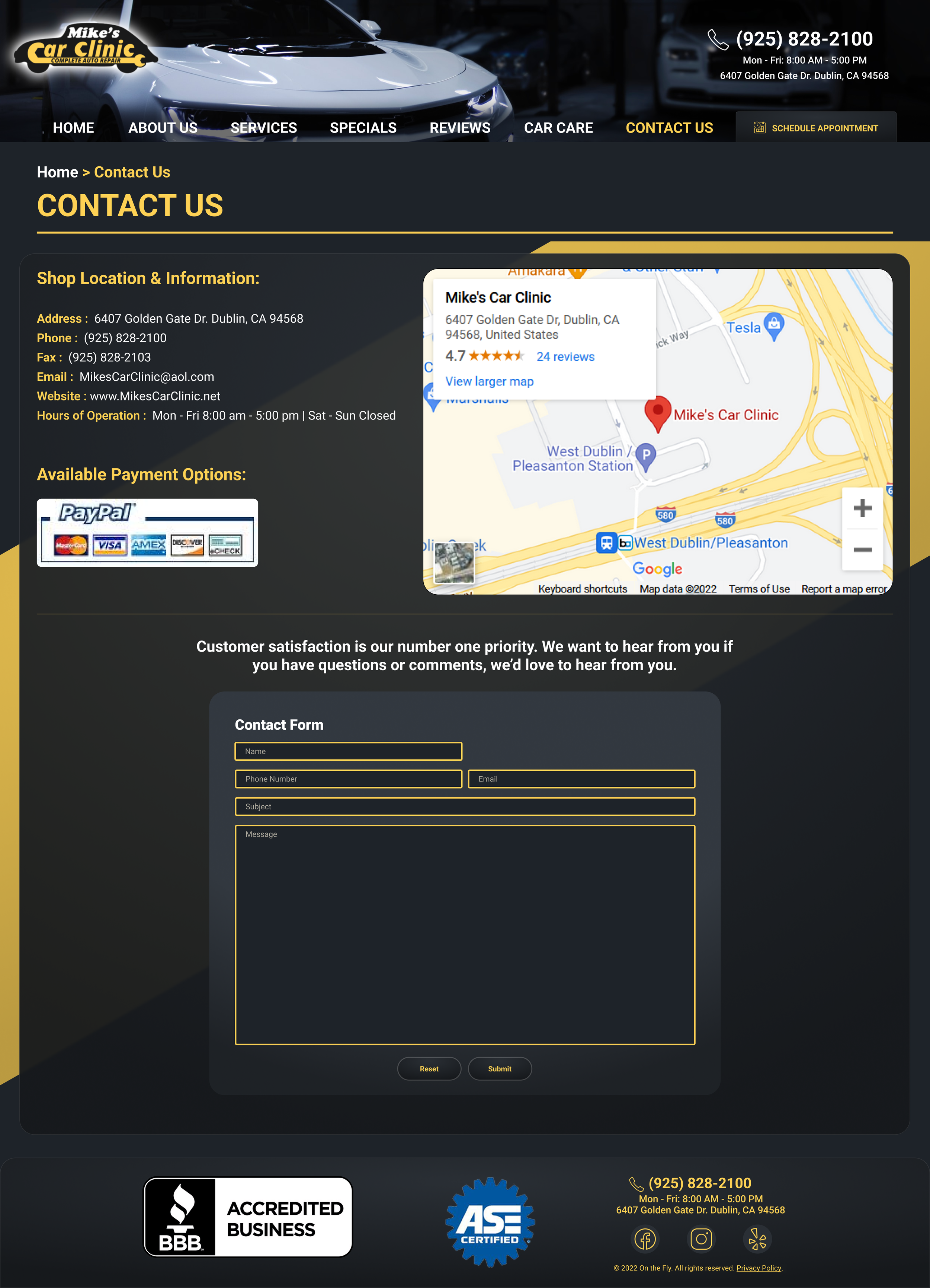
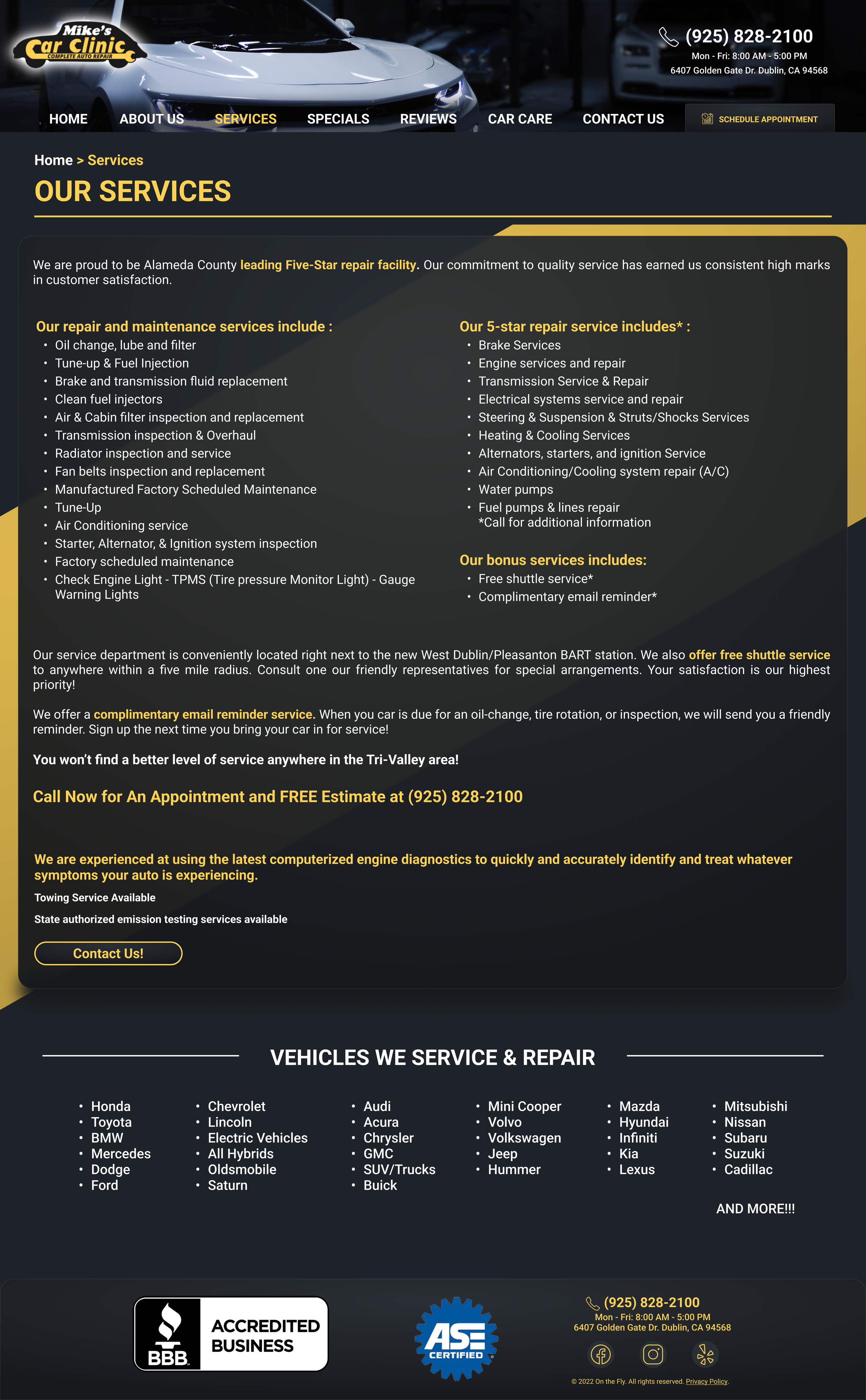
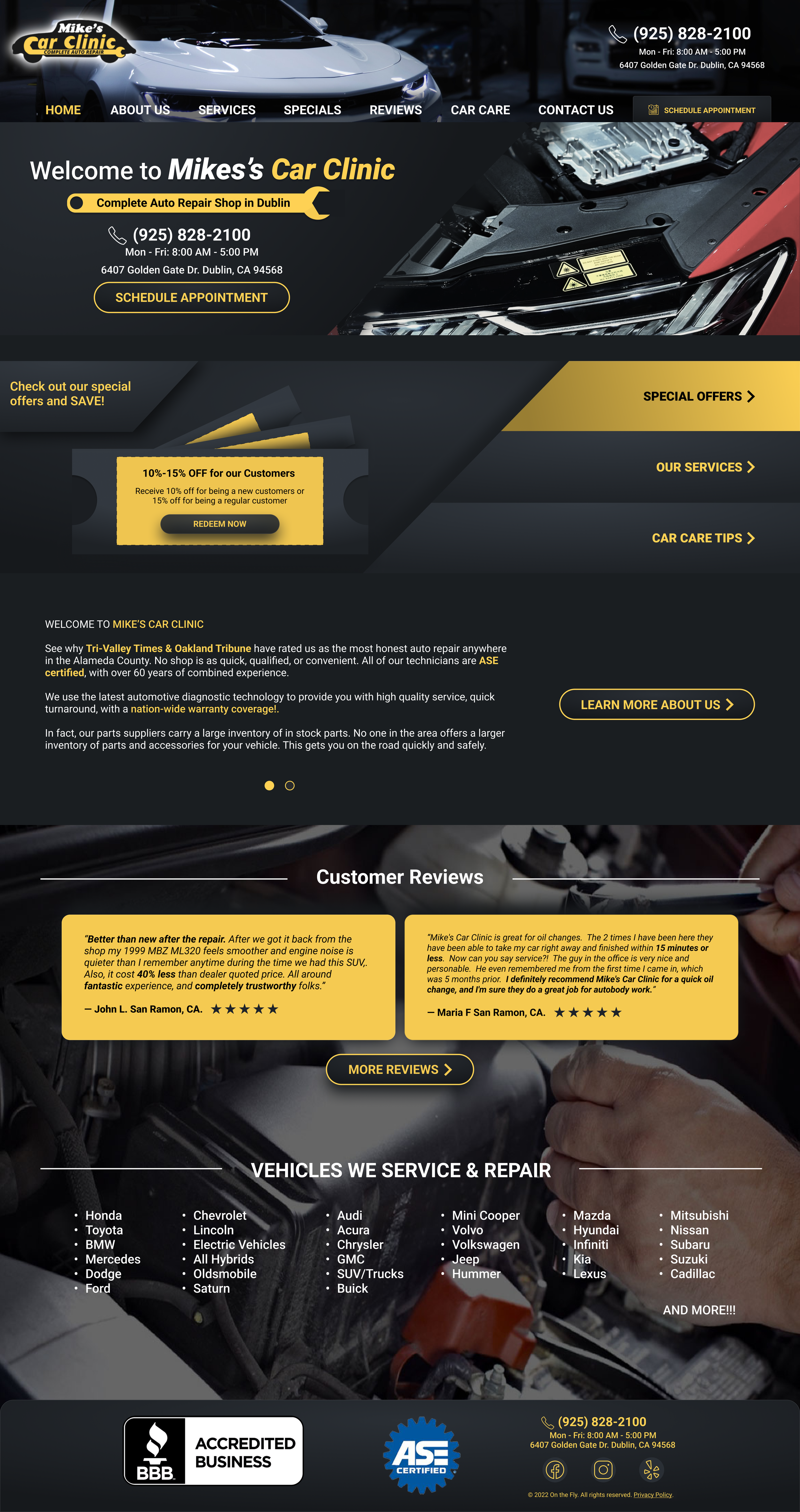
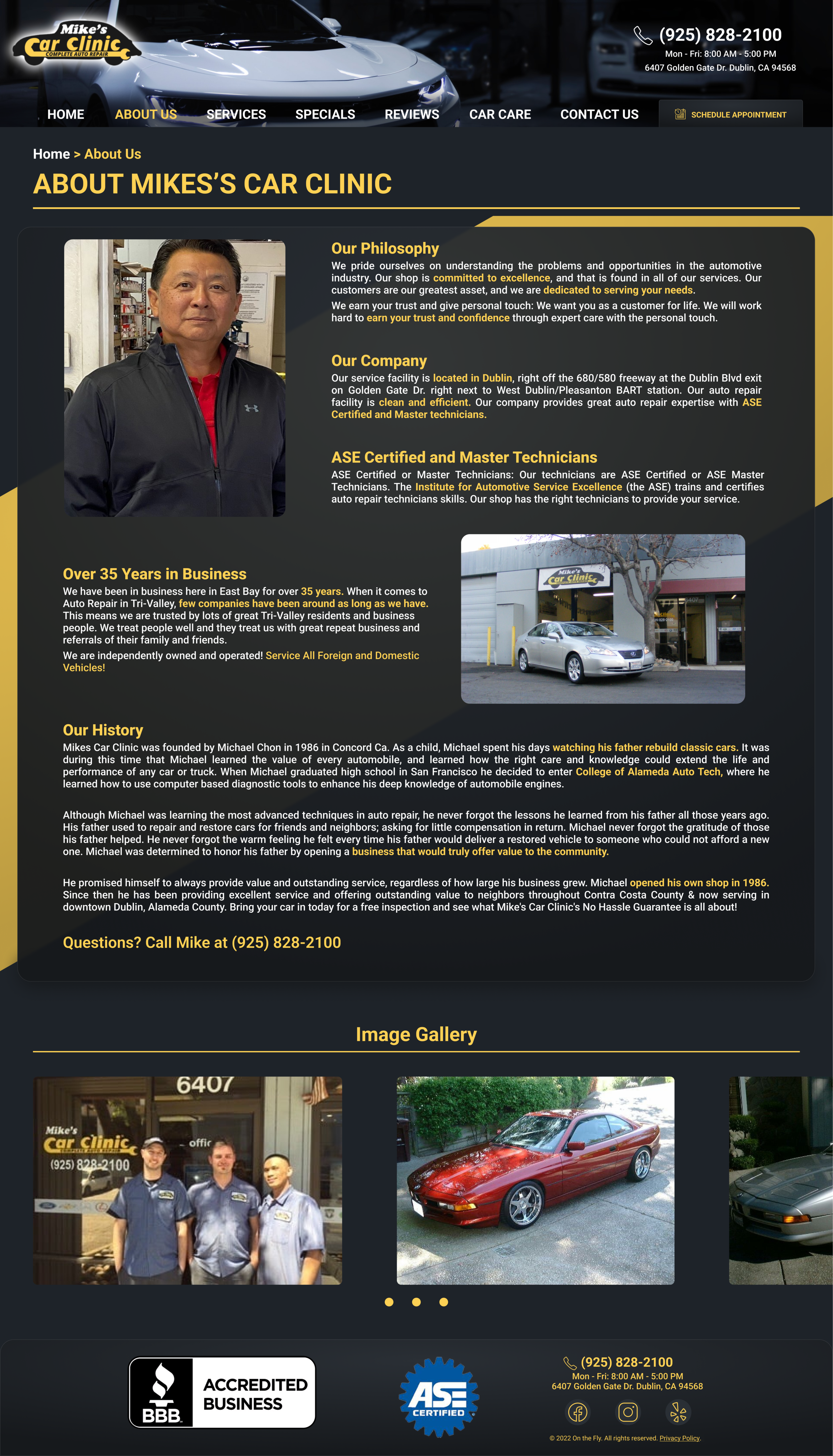
Again, with many iterations and testing, we came to this final desktop design. Our class wanted us to focus on the mobile design first and then move on to the desktop design where we tried our best to be consistent with the colors of the mobile version. With the desktop here, we really wanted to convey that modern refresh of the website while also prioritizing the user engagement through appointments and special offers(through client request). We updated the images as well to make the site feel more new and more visual as users go through the walls of text along with placing priority in what is shown first and how it is shown with meaningful titles and highlights. The best example shown here would be through the Home page and About Us page.
Final Takeaways
Learning how to consider a real-world client’s needs along with user needs
Developing more experience with Figma
Learning not everyone will be at their best all the time especially with unexpected circumstances that come.
A team isn’t about expecting results from each other, but communicating with each other, understanding one another, and helping each other to fill one another’s gaps
Usability testing and interviews were very biased and not representative
I understand that by interviewing and doing usability testing with Young adults from the ages of 20-21 narrowed our scope/insight into how actual customers would interact with auto repair shops